The Pareto chart template is another form of graph that is used to provide visual representation of data. This kind of graphs are used when you need to know causes in a process. These Pareto charts are used to analyze data to find frequency of problems. While doing a project there are various problems arises but most of the time we missed that significant one that causes disturbance in the rest of the task with the assistance of Pareto chart you will find that particular error. When a new business is established there is a need to analyze broad causes by looking at their specific components these templates can be used. A Pareto chart can help the team select the appropriate areas to focus on.
Details of Pareto Chart Template
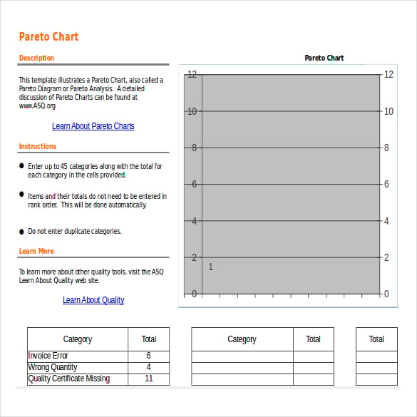
Using this template you can organize your data much more easily and efficiently. Usually bar graphs and line graphs are used to represent information about a specific task. You have to choose a specific format for this type of charts and can make you graphs attractive also by well designing them and adding colors to them. You can also use it to give a presentation in your work place as it will represent your information in an elegant and more understandable way. The chart should be relevant to your information and goes with the content of your presentation. This chart will surely fulfill the purpose of your presentation if you make it with all your attention.
How to Use Pareto Chart Template
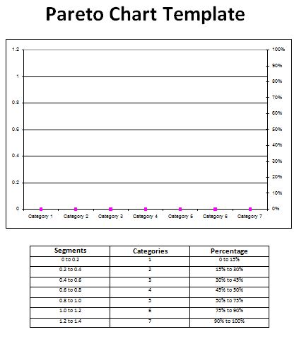
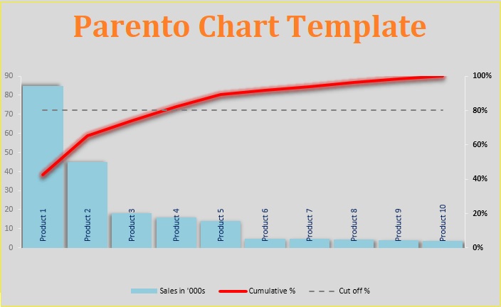
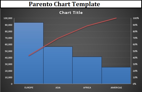
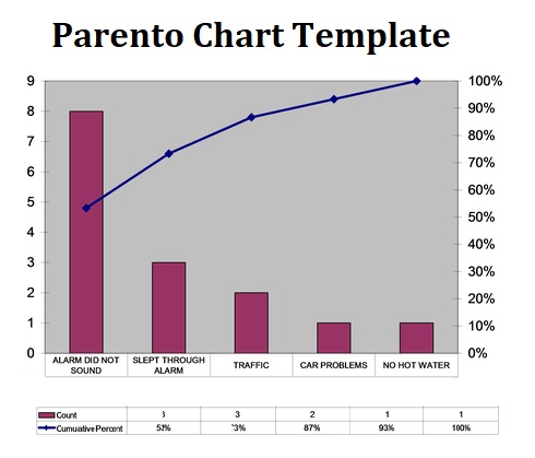
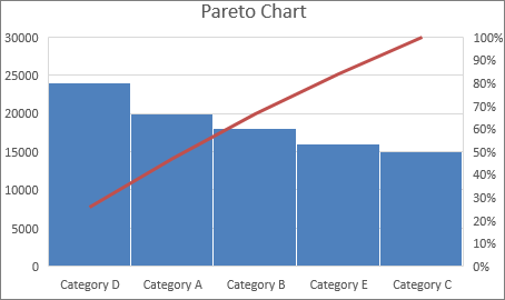
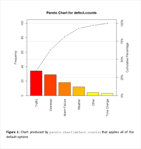
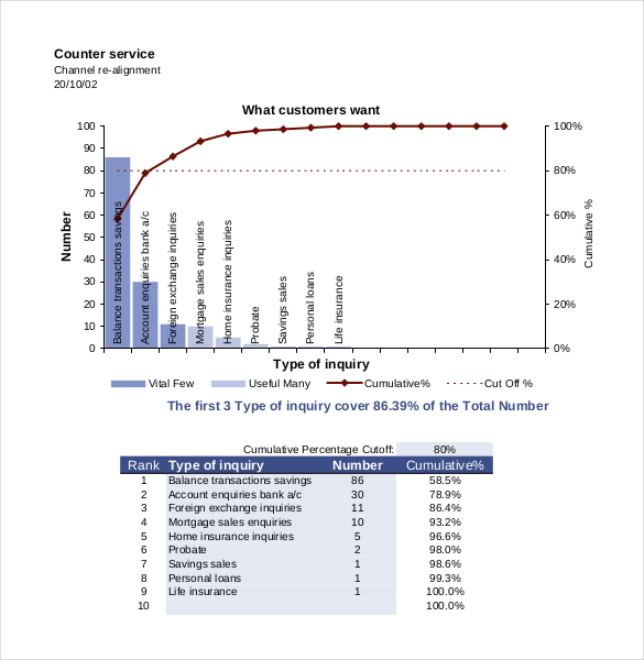
Generally, these Pareto chart templates are created by a simple spreadsheet program. The left side of a vertical axis of a chart is labeled frequency and the right side of the vertical axis of a chart is the cumulative percentage. The horizontal axis is marked with the group names. The purpose of a Pareto chart format is to emphasize the most important elements that affect a variable. The simple graphical visualization makes a Pareto chart extremely easy to understand and efficient tool to explain the scenario and its basic causes to the audience.
